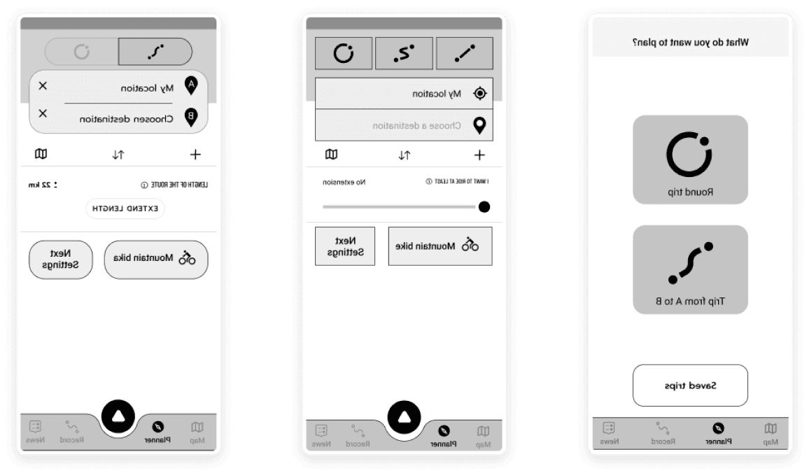
Redesign of the planner screen
One of my larger tasks in Cyclers was the redesign of the planner screen. It was overloaded with information, had suboptimal UX in a few sections, and the UI was somewhat outdated. The app's founders, with whom I collaborated throughout all the design stages, had a few ideas on how to improve the planner.
I took the ideas and created low-fidelity wireframes for three versions of the planner screen:
A) The first version reflected the current appearance of the planner screens at that time.
B) The second version involved dividing the process into multiple steps/screens.
C) The third version was a combination of the previous two, incorporating elements from the original planner while introducing multiple steps.
Low-fidelity wireframe design
A - Original
B - Division into multiple steps/screens
C - Combination of the original planner and with multiple steps
Prototype
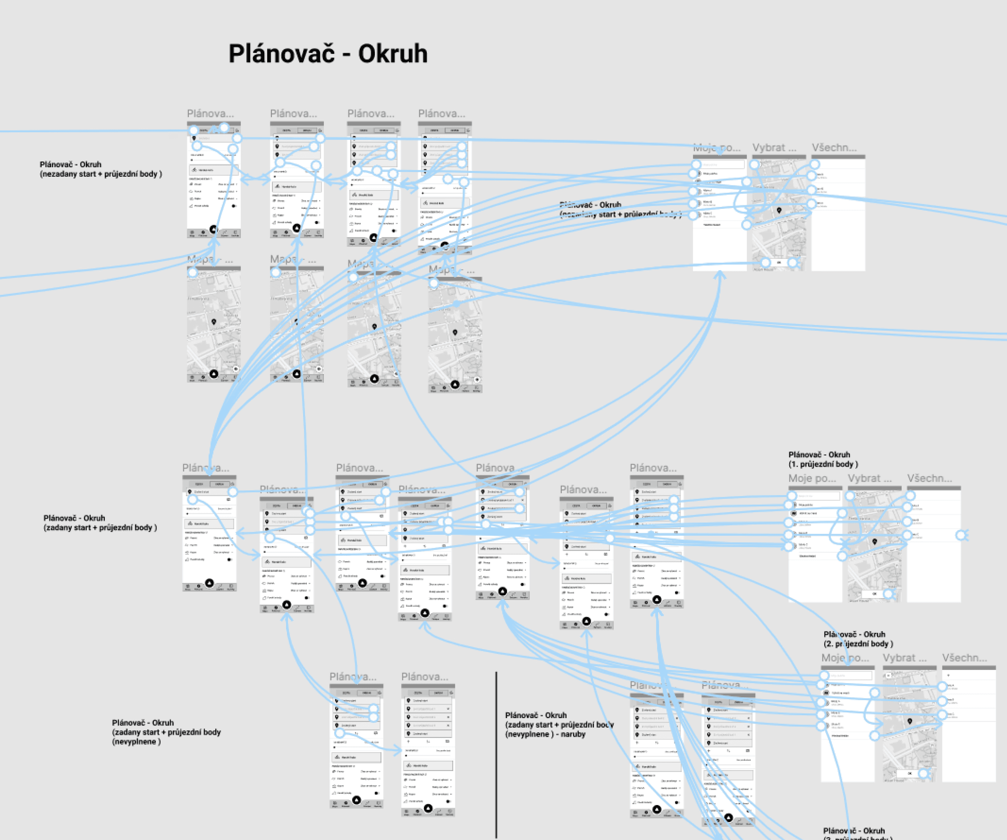
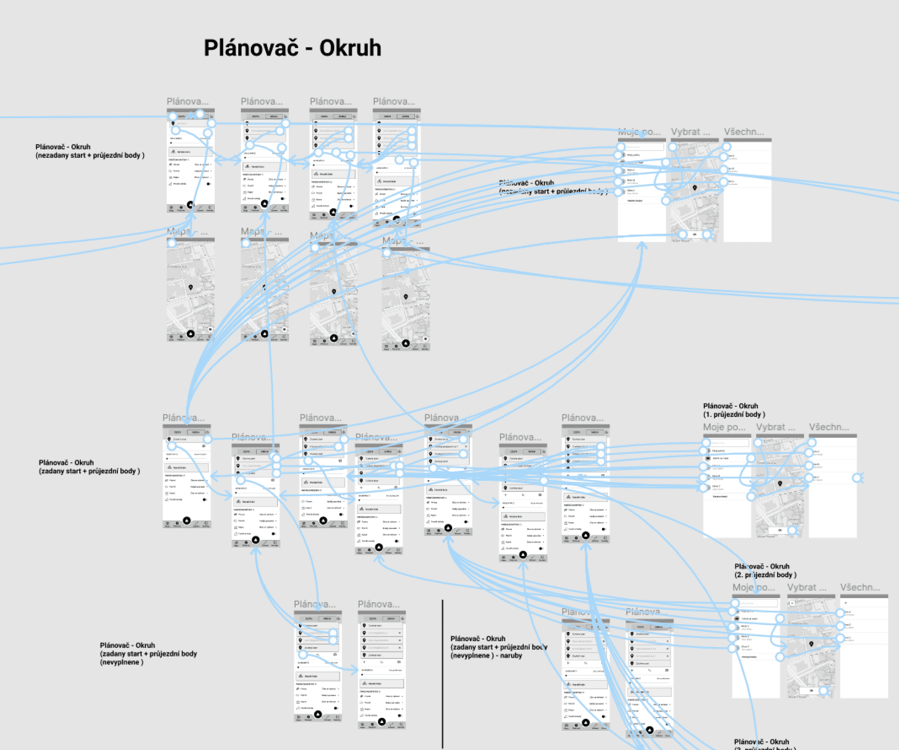
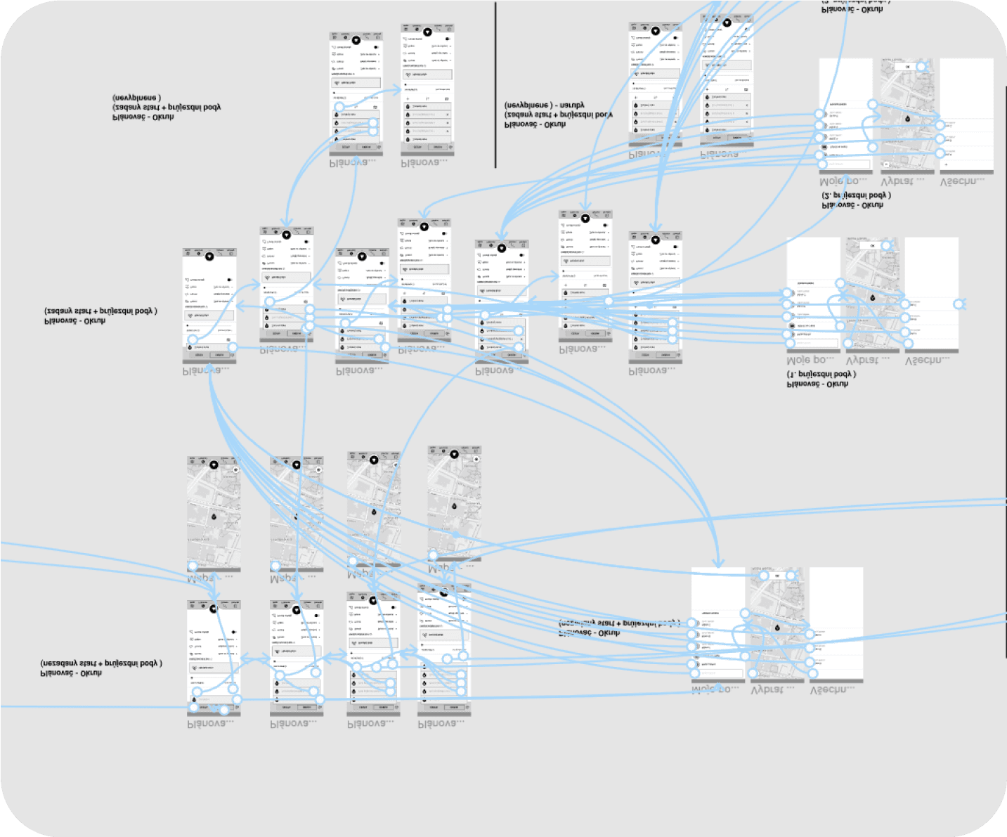
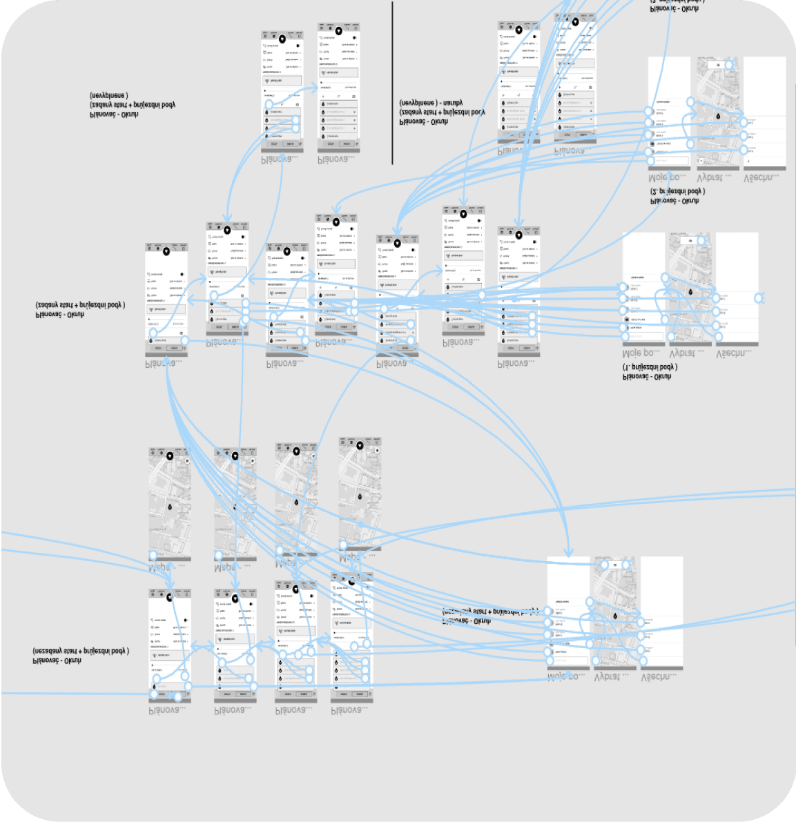
First, wireframes were created with several changes. Once we were satisfied with the results, I consolidated a few sections to avoid getting lost in the multitude of wireframes. Then, I began connecting all the wireframes to create task scenarios for user testing. We tested it multiple times to ensure everything was properly connected. In the end, I had three versions of a clickable prototype that simulated a mobile app for user testing.
Creating a prototype
Low-fidelity - some design updates after user testing
High-fidelity design Round trip - packed/unpacked state
And many more...
Here, I'd like to highlight some interesting aspects of my UX/UI design work on this mobile app. I hope the screenshots aren't too overwhelming. I also revamped the previous design system, upgrading colors, fonts, and design elements.
In addition, I designed a completely new logo and app icon, including a new icon for bike activities.
Internal and external user testing is often conducted with wireframes or prototypes. I created numerous animations for marketing campaigns, including banners for social media, and I also prepared app previews for the App Store and Google Play. Furthermore, the Android app differs slightly from iOS, so it always requires design adjustments.

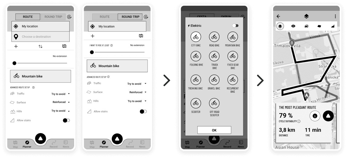
Redesign of the planner screen
One of my bigger tasks in Cyclers was the redesign of the planner screen. It was a bit overloaded with information, didn't have the best UX in a few sections, and the UI was a bit outdated. The founders of the app, with whom I constantly collaborated throughout all the design stages, had a few ideas on how to improve the planner.
I took the ideas and created low-fidelity wireframes for three versions of the planner screen:
A) The first version reflected the current appearance of the planner screens at that time.
B) The second version involved dividing the process into multiple steps/screens.
C) The third version was a combination of the previous two, incorporating elements from the original planner while introducing multiple steps.
Low-fidelity wireframe design
A - Original
B - Division into multiple steps/screens
C - Combination of the original planner and with multiple steps
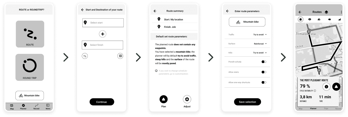
Prototype
First, wireframes were created with several changes. Once we were satisfied with the results, I consolidated a few sections to avoid getting lost in the multitude of wireframes. Then, I began connecting all the wireframes to create task scenarios for user testing. We tested it multiple times to ensure everything was properly connected. In the end, I had three versions of a clickable prototype that simulated a mobile app for user testing.
Creating a prototype
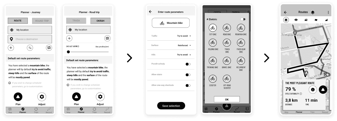
Low-fidelity - some design updates after user testing

High-fidelity design Round trip - packed/unpacked state
Enhancement of the other selected parts of the app
The original App intro/Onboarding
New app-intro/Onboarding
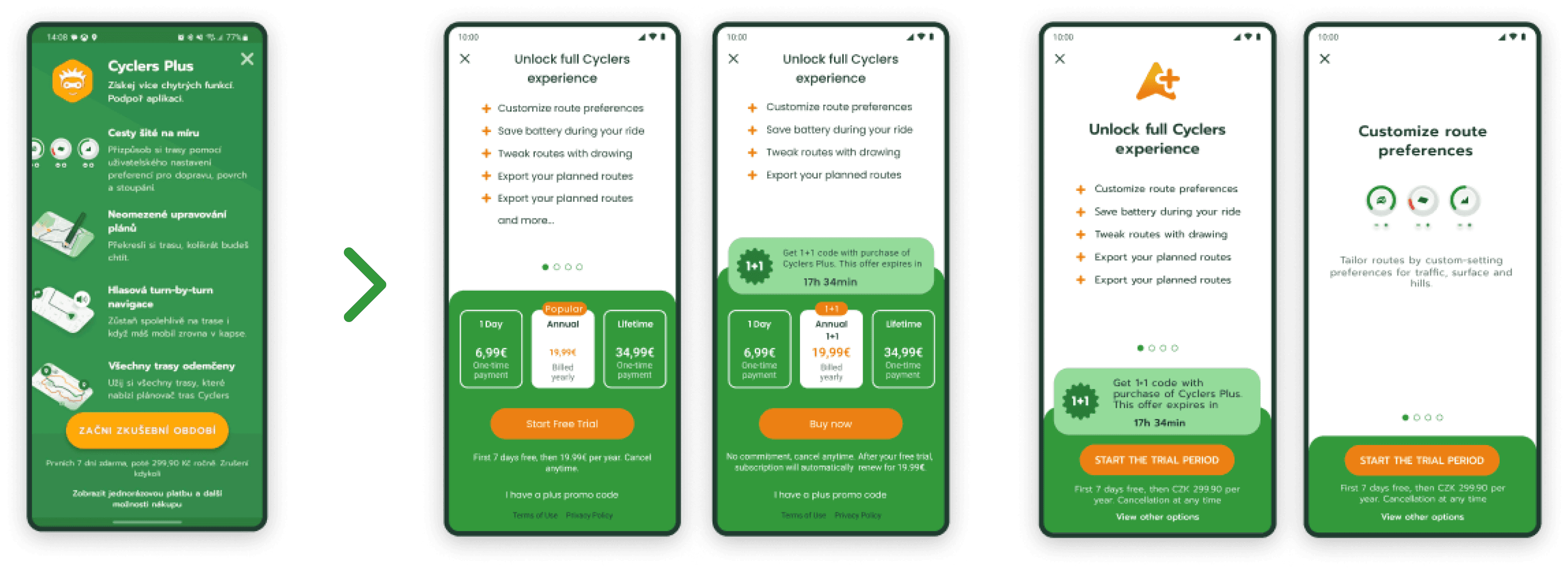
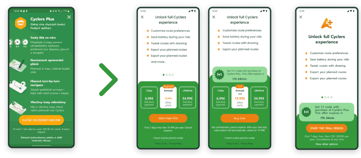
Paywall
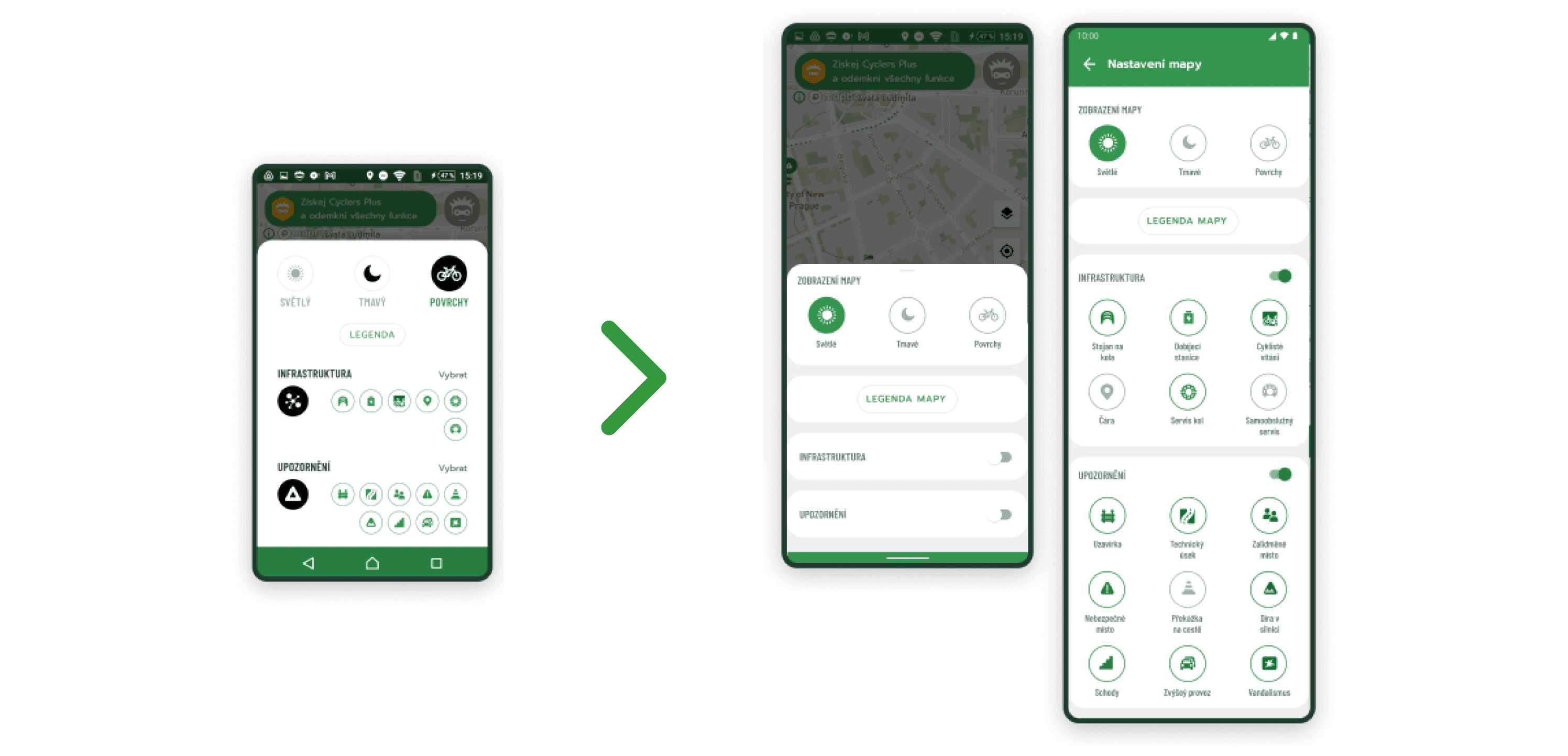
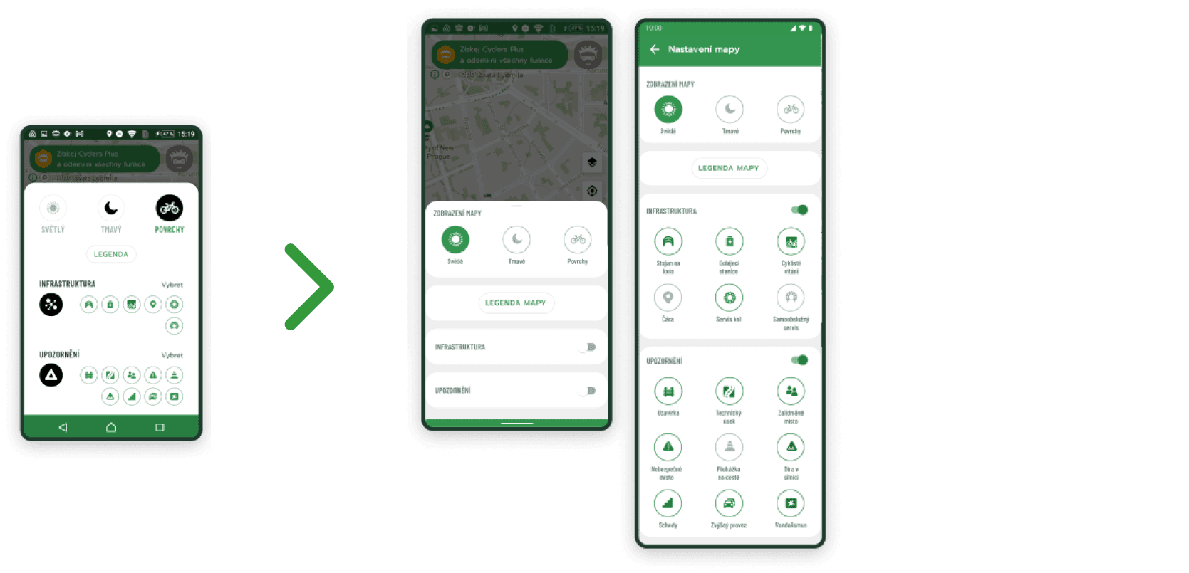
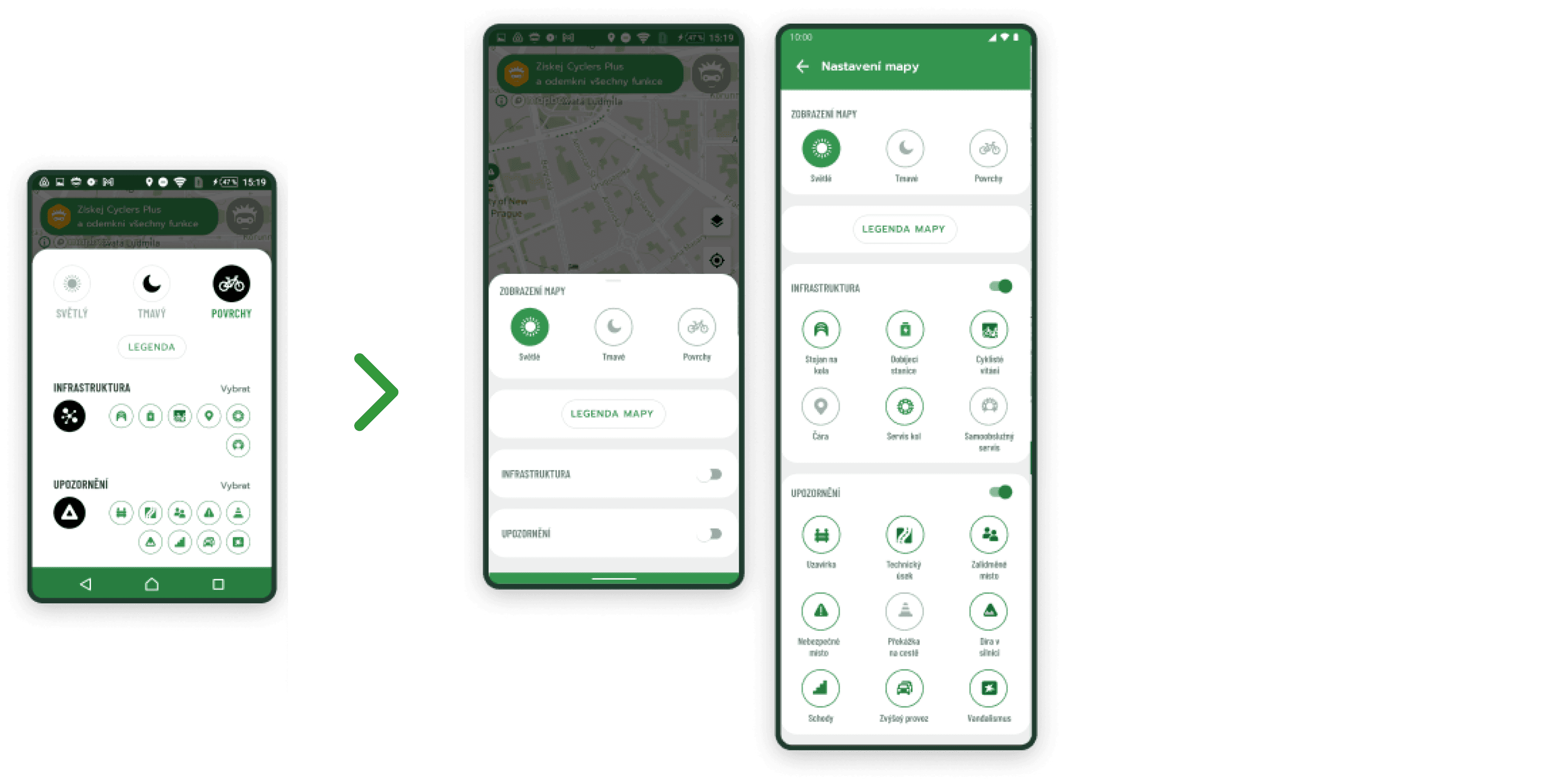
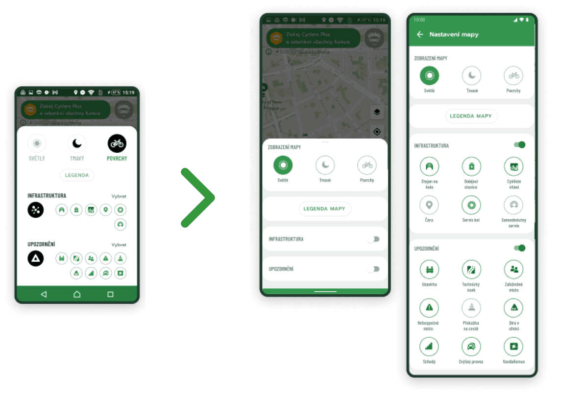
Map setting
Updates/upgardes in design system
This was probably one of the most complex and challenging tasks at cyclers app. Previous design system kind of existed but have to be improved. App needed an upgrade in almost every part, as find a new fonts, colors, new logo, visual elements and more.
Old logo
Old icon
New icon
New logo
Old icon
New icon
Cyclers
Old icon
Old icon
New icon
New icon
And many more...
Here, I'd like to highlight some interesting aspects of my UX/UI design work on this mobile app. I hope the screenshots aren't too overwhelming. I also revamped the previous design system, upgrading colors, fonts, and design elements.
In addition, I designed a completely new logo and app icon, including a new icon for bike activities.
Internal and external user testing is often conducted with wireframes or prototypes. I created numerous animations for marketing campaigns, including banners for social media, and I also prepared app previews for the App Store and Google Play. Furthermore, the Android app differs slightly from iOS, so it always requires design adjustments.
Look at other projects as well

Cyclers App
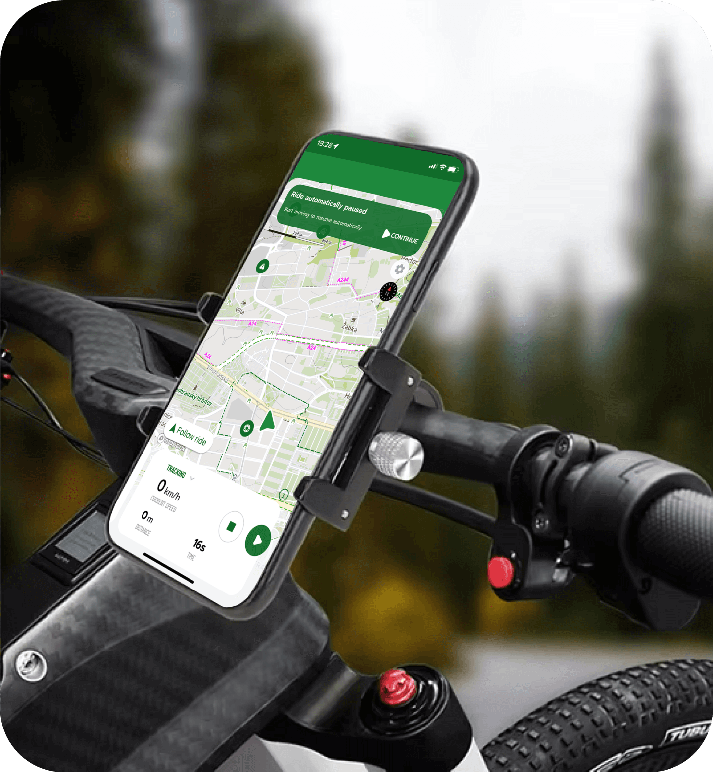
Bike navigation (2021 - 2023)
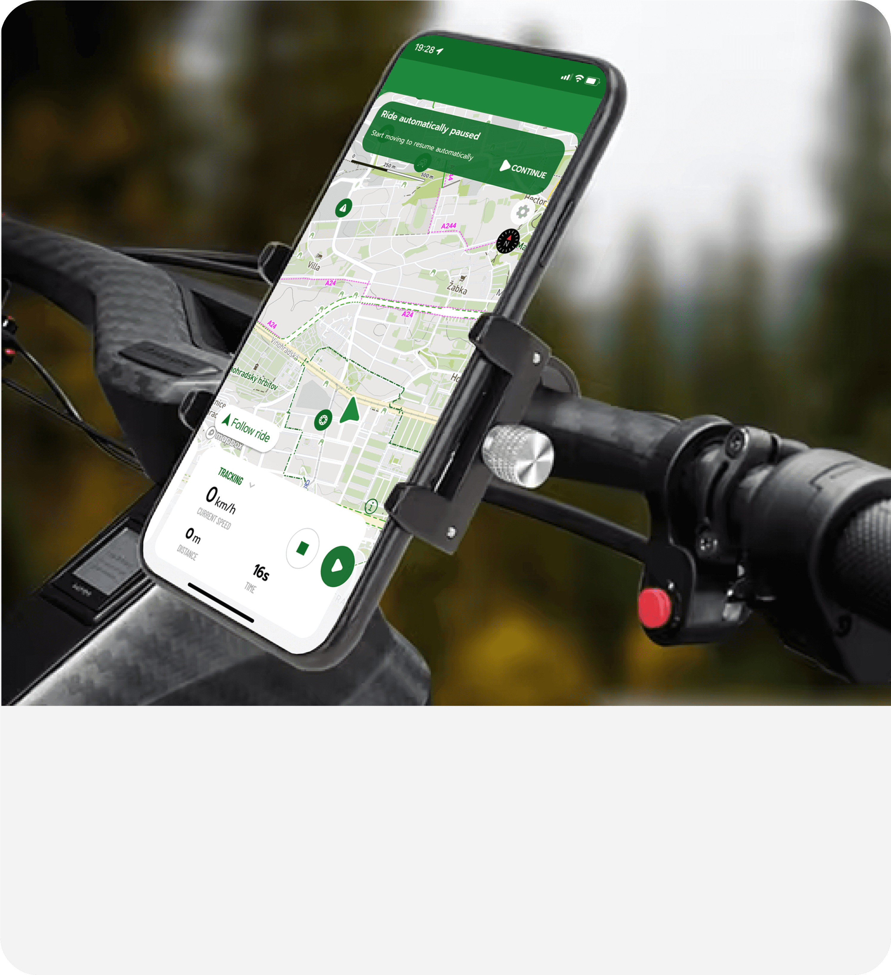
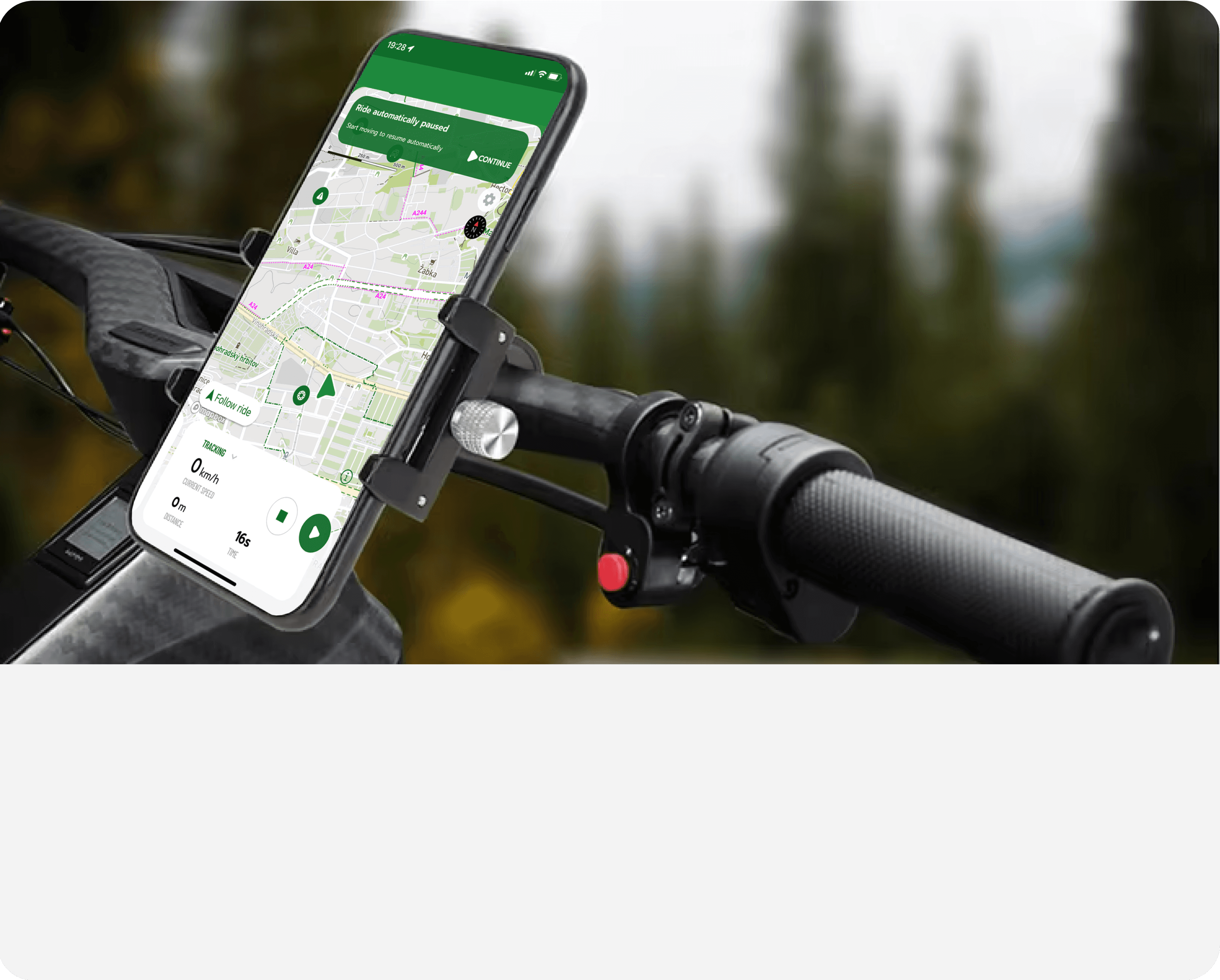
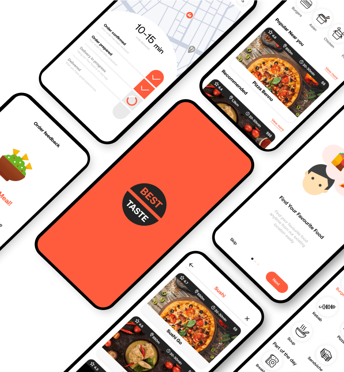
What was my role as a UX/UI designer in the Cyclers bike navigation application? As a UX/UI designer at the IT startup UMOTIONAL s.r.o., specifically on their biggest project, the Cyclers app, I faced numerous challenges. Here are some examples of the top challenges I encountered, along with a brief overview of my design process, highlighting the most interesting ones with a few explanatory words for each.
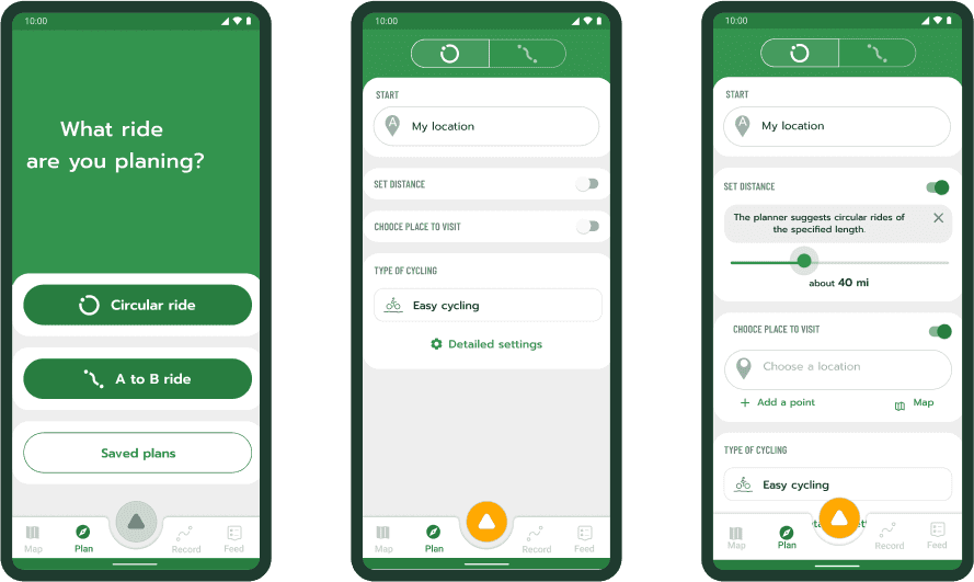
Redesign of the planner screen
One of my bigger tasks in Cyclers was the redesign of the planner screen. It was a bit overloaded with information, didn't have the best UX in a few sections, and the UI was a bit outdated. The founders of the app, with whom I constantly collaborated throughout all the design stages, had a few ideas on how to improve the planner.
I took the ideas and created low-fidelity wireframes for three versions of the planner screen:
A) The first version reflected the current appearance of the planner screens at that time.
B) The second version involved dividing the process into multiple steps/screens.
C) The third version was a combination of the previous two, incorporating elements from the original planner while introducing multiple steps.
Low-fidelity wireframe design
A - Original
B - Division into multiple steps/screens
C - Combination of the original planner and with multiple steps
Prototype
First, wireframes were created with several changes. Once we were satisfied with the results, I consolidated a few sections to avoid getting lost in the multitude of wireframes. Then, I began connecting all the wireframes to create task scenarios for user testing. We tested it multiple times to ensure everything was properly connected. In the end, I had three versions of a clickable prototype that simulated a mobile app for user testing.
Creating a prototype
Low-fidelity - some design updates after user testing
High-fidelity design Round trip - packed/unpacked state
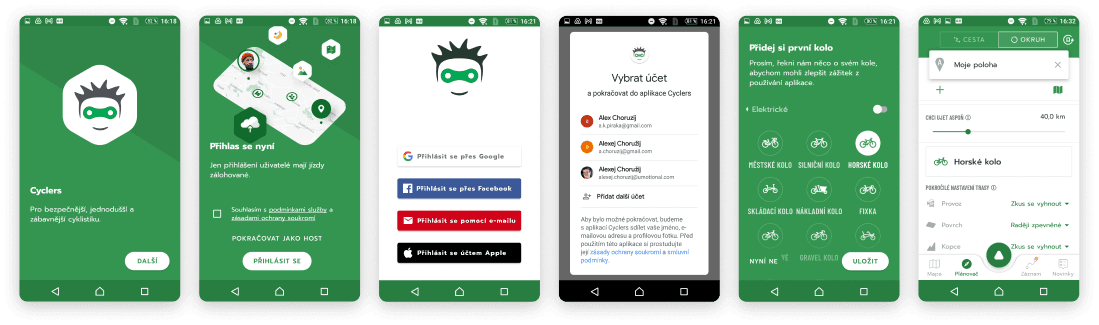
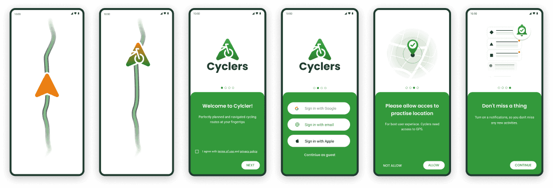
Enhancement of the other selected parts of the app
The original app intro/Onboarding
New app-intro/Onboarding
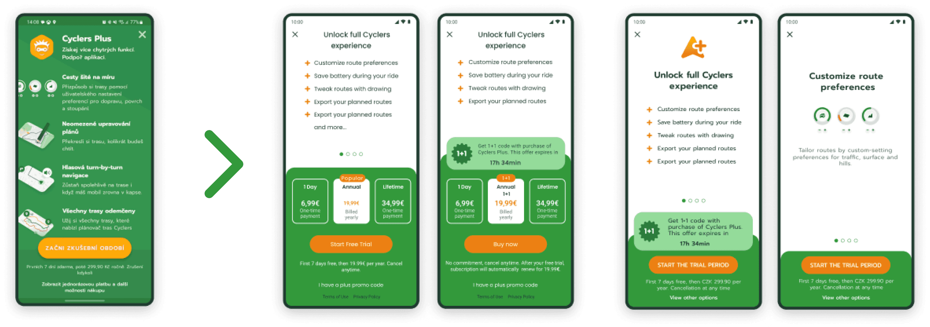
Paywall

Map setting
Look at other projects as well

I hope you enjoy your journey through my portfolio.
Let’s discuss your project!
And many more...
Here, I'd like to highlight some interesting aspects of my UX/UI design work on this mobile app. I hope the screenshots aren't too overwhelming. I also revamped the previous design system, upgrading colors, fonts, and design elements.
In addition, I designed a completely new logo and app icon, including a new icon for bike activities.
Internal and external user testing is often conducted with wireframes or prototypes. I created numerous animations for marketing campaigns, including banners for social media, and I also prepared app previews for the App Store and Google Play. Furthermore, the Android app differs slightly from iOS, so it always requires design adjustments.
Updates/upgrades in design system
This was probably one of the most complex and challenging tasks at cyclers app. Previous design system kind of existed but have to be improved. App needed an upgrade in almost every part, as find a new fonts, colors, new logo, visual elements and more.
Old logo
Old icon
New icon
New logo
Old icon
New icon
Cyclers
Old icon
Old icon
New icon
New icon
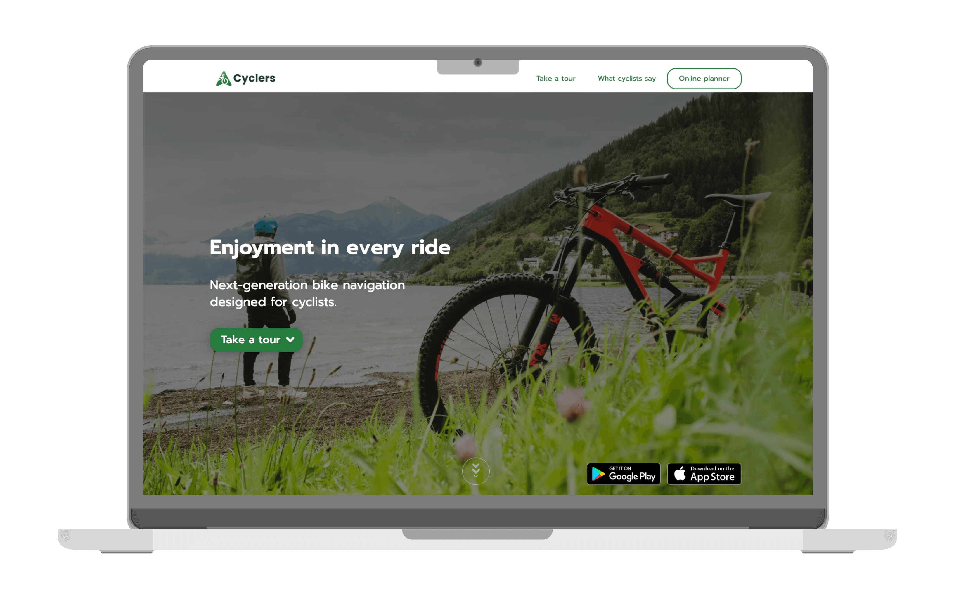
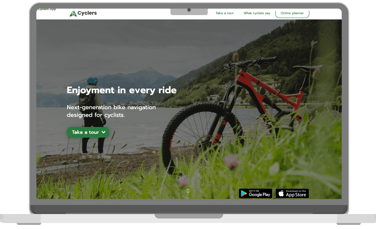
Cyclers web redesign (cyclers.app)
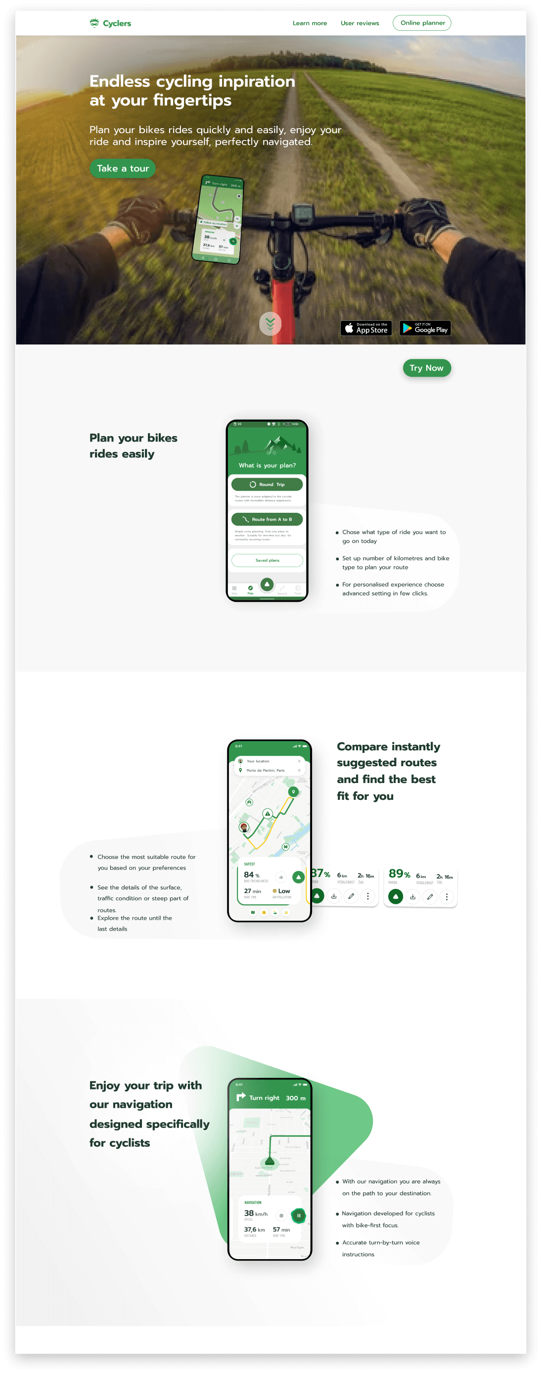
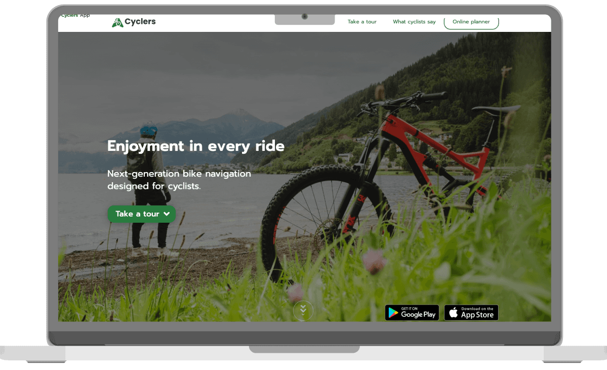
I was tasked with redesigning Cyclers' website. My main responsibility was to revamp the existing website for the Cyclers app. I created a few versions of lo-fi designs, focusing on the layout and organisation of elements. After receiving feedback from coworkers and making some necessary changes, I started thinking about the high-fidelity design.
At the beginning, I designed a basic graphic for each section of the website's content. However, we aimed to keep it simple while showcasing the main features of the app without excessive text and explanatory images. To achieve this, I decided to use animations, which I created based on a basic script. The animations were crafted using After Effects, done by me as well.
Low-fidelity design
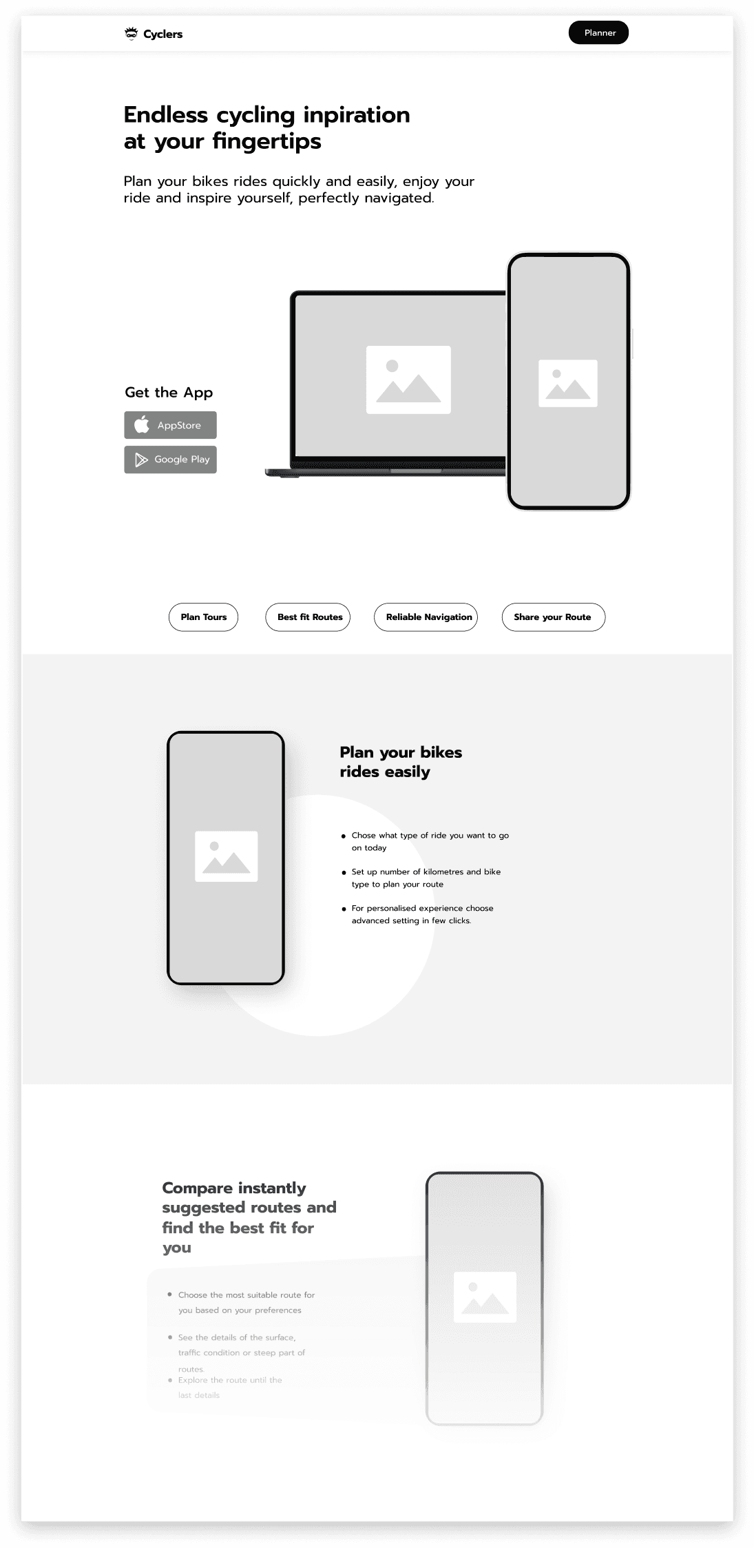
High-fidelity design

Cyclers web redesign (cyclers.app)
I was tasked with redesigning Cyclers' website. My main responsibility was to revamp the existing website for the Cyclers app. I created a few versions of lo-fi designs, focusing on the layout and organisation of elements. After receiving feedback from coworkers and making some necessary changes, I started thinking about the high-fidelity design.
At the beginning, I designed a basic graphic for each section of the website's content. However, we aimed to keep it simple while showcasing the main features of the app without excessive text and explanatory images. To achieve this, I decided to use animations, which I created based on a basic script. The animations were crafted using After Effects, done by me as well.
High-fidelity design
I hope you enjoy your journey through my portfolio.
Let’s discuss your project!
Cyclers App
Bike navigation
2021 - 2023
Duration
Role
Ux/Ui designer
Figma
PS
AE
Tools
IT
Industries
Cyclers team
Team
What was my role as a UX/UI designer in the Cyclers bike navigation application? As a UX/UI designer at the IT startup UMOTIONAL s.r.o., specifically on their biggest project, the Cyclers app, I faced numerous challenges. Here are some examples of the top challenges I encountered, along with a brief overview of my design process, highlighting the most interesting ones with a few explanatory words for each.
Cyclers web redesign (cyclers.app)
I was tasked with redesigning Cyclers' website. My main responsibility was to revamp the existing website for the Cyclers app. I created a few versions of lo-fi designs, focusing on the layout and organisation of elements. After receiving feedback from coworkers and making some necessary changes, I started thinking about the high-fidelity design.
At the beginning, I designed a basic graphic for each section of the website's content. However, we aimed to keep it simple while showcasing the main features of the app without excessive text and explanatory images. To achieve this, I decided to use animations, which I created based on a basic script. The animations were crafted using After Effects, done by me as well.
Low-fidelity design
High-fidelity design
Enhancement of the other selected parts of the app
The original App intro/Onboarding
New app-intro/Onboarding
Paywall
Map setting
Updates/upgrades in design system
This was probably one of the most complex and challenging tasks at cyclers app. Previous design system kind of existed but have to be improved. App needed an upgrade in almost every part, as find a new fonts, colors, new logo, visual elements and more.
Old logo
Old icon
New icon
New logo
Old icon
New icon
Cyclers
Old icon
Old icon
New icon
New icon
I hope you enjoy your journey through my portfolio.
Let’s discuss your project!
Cyclers App
Bike navigation
2021 - 2023
Duration
Role
Ux/Ui designer
Figma
PS
AE
Tools
IT
Industries
Cyclers team
Team
What was my role as a UX/UI designer in the Cyclers bike navigation application? As a UX/UI designer at the IT startup UMOTIONAL s.r.o., specifically on their biggest project, the Cyclers app, I faced numerous challenges. Here are some examples of the top challenges I encountered, along with a brief overview of my design process, highlighting the most interesting ones with a few explanatory words for each.
Cyclers App
Bike navigation (2021 - 2023)
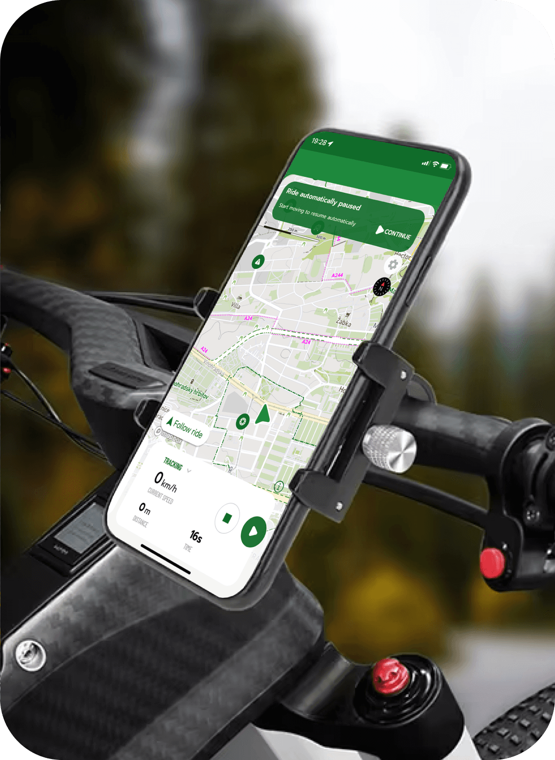
What was my role as a UX/UI designer in the Cyclers bike navigation application? As a UX/UI designer at the IT startup UMOTIONAL s.r.o., specifically on their biggest project, the Cyclers app, I faced numerous challenges. Here are some examples of the top challenges I encountered, along with a brief overview of my design process, highlighting the most interesting ones with a few explanatory words for each.
Cyclers web redesign (cyclers.app)
I was tasked with redesigning Cyclers' website. My main responsibility was to revamp the existing website for the Cyclers app. I created a few versions of lo-fi designs, focusing on the layout and organisation of elements. After receiving feedback from coworkers and making some necessary changes, I started thinking about the high-fidelity design.
At the beginning, I designed a basic graphic for each section of the website's content. However, we aimed to keep it simple while showcasing the main features of the app without excessive text and explanatory images. To achieve this, I decided to use animations, which I created based on a basic script. The animations were crafted using After Effects, done by me as well.
High-fidelity design
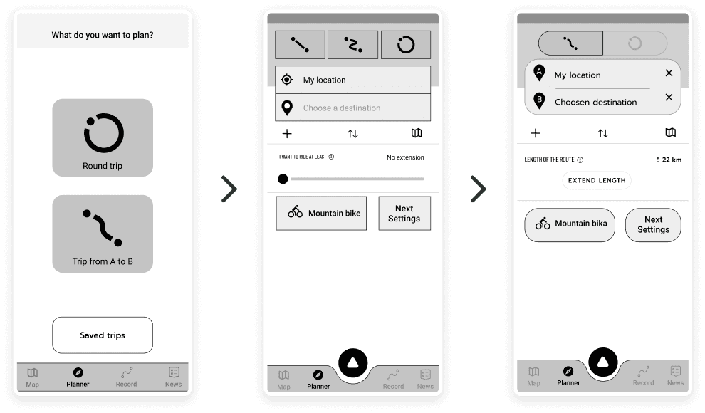
Redesign of the planner screen
I was tasked with redesigning Cyclers' website. My main responsibility was to revamp the existing website for the Cyclers app. I created a few versions of lo-fi designs, focusing on the layout and organisation of elements. After receiving feedback from coworkers and making some necessary changes, I started thinking about the high-fidelity design.
At the beginning, I designed a basic graphic for each section of the website's content. However, we aimed to keep it simple while showcasing the main features of the app without excessive text and explanatory images. To achieve this, I decided to use animations, which I created based on a basic script. The animations were crafted using After Effects, done by me as well.
I took the ideas and created low-fidelity wireframes for three versions of the planner screen:
A) The first version reflected the current appearance of the planner screens at that time.
B) The second version involved dividing the process into multiple steps/screens.
C) The third version was a combination of the previous two, incorporating elements from the original planner while introducing multiple steps.
Low-fidelity wireframe design
A - Original
B - Division into multiple steps/screens
C - Combination of the original planner and with multiple steps
Prototype
First, wireframes were created with several changes. Once we were satisfied with the results, I consolidated a few sections to avoid getting lost in the multitude of wireframes. Then, I began connecting all the wireframes to create task scenarios for user testing. We tested it multiple times to ensure everything was properly connected. In the end, I had three versions of a clickable prototype that simulated a mobile app for user testing.
Creating a prototype
Lo-fi design update - some design updates after user testing
HI-FI design Round trip - packed/unpacked state
Enhancement of the other selected parts of the app
The original app intro/Onboarding
New app-intro/Onboarding
Paywall
Map setting
Updates/upgrades in design system
This was probably one of the most complex and challenging tasks at cyclers app. Previous design system kind of existed but have to be improved. App needed an upgrade in almost every part, as find a new fonts, colors, new logo, visual elements and more.
Old logo
Old icon
New icon
New logo
Old icon
New icon
Cyclers
Old icon
Old icon
New icon
New icon
And many more...
Here, I'd like to highlight some interesting aspects of my UX/UI design work on this mobile app. I hope the screenshots aren't too overwhelming. I also revamped the previous design system, upgrading colors, fonts, and design elements.
In addition, I designed a completely new logo and app icon, including a new icon for bike activities.
Internal and external user testing is often conducted with wireframes or prototypes. I created numerous animations for marketing campaigns, including banners for social media, and I also prepared app previews for the App Store and Google Play. Furthermore, the Android app differs slightly from iOS, so it always requires design adjustments.
Look at other projects as well
Entel labs
Web / UI design
2021 (2 weeks)
Food delivery app
Case study
2021 (2 weeks)