A quick peek at the old logo and website design
I probably didn’t need to point out that this workout, gym, and supplement website looked outdated and needed a redesign. The logo had already undergone some redesigns but could still be improved and made more versatile. It only featured the name and a tornado shape.


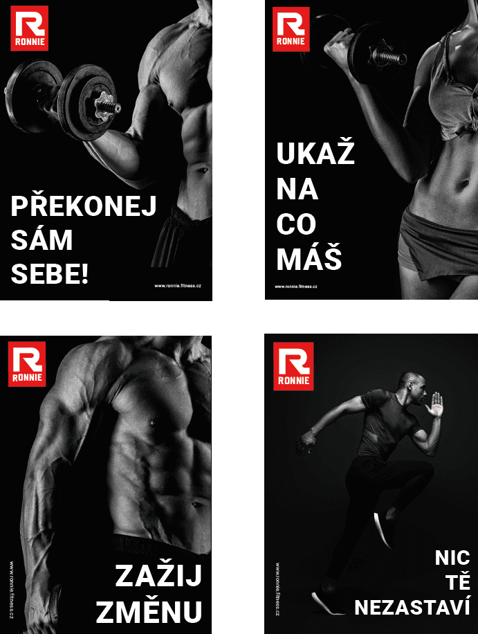
My new logo design
Here are a few variants and color combinations for my new logo redesign. I chose a minimalist typography style that allows the logo to be used with or without the gym's name. The red color can be used alone or in combination with black. The symbol was a modified letter 'R,' and the font used for the text is 'Teuton.'
Text version & color

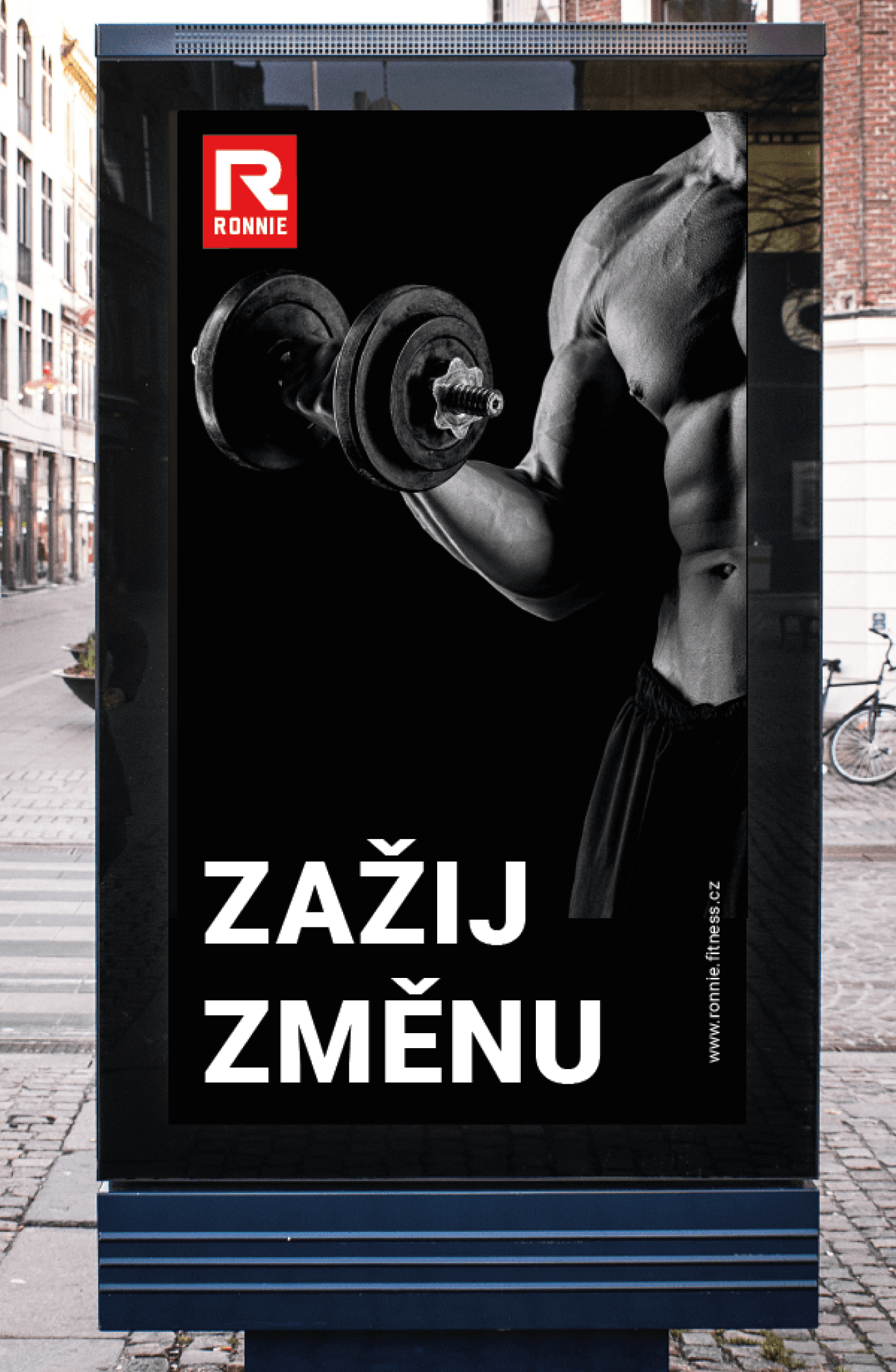
Examples of logo usage
Here are examples of gym posters and the logo used as decorations in the gym
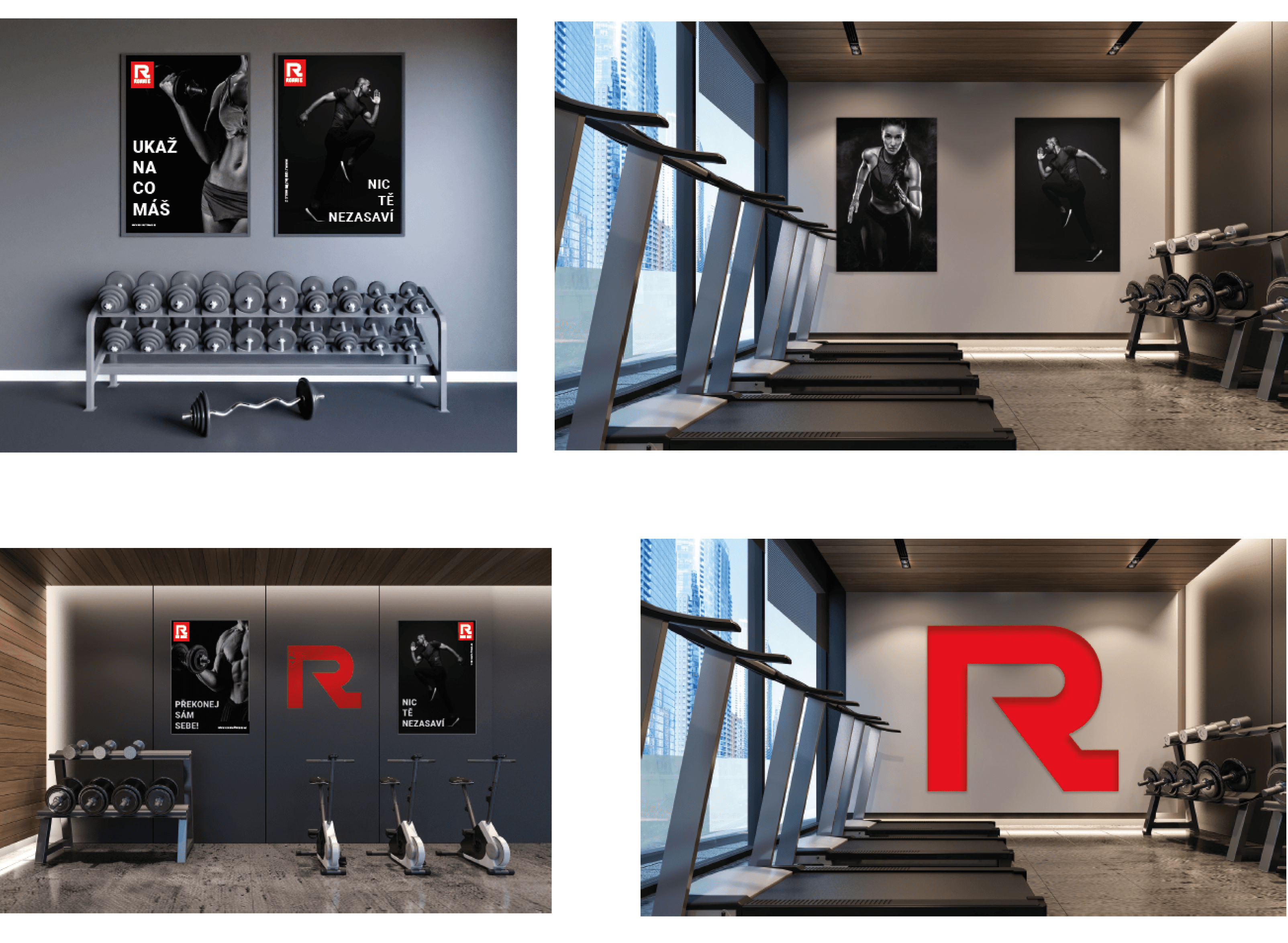

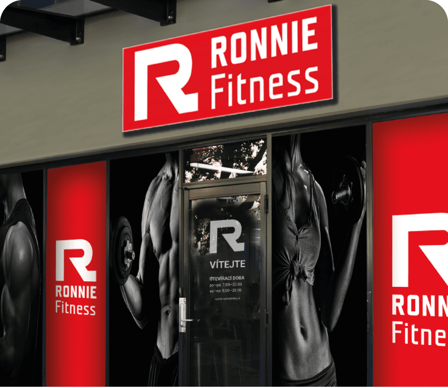
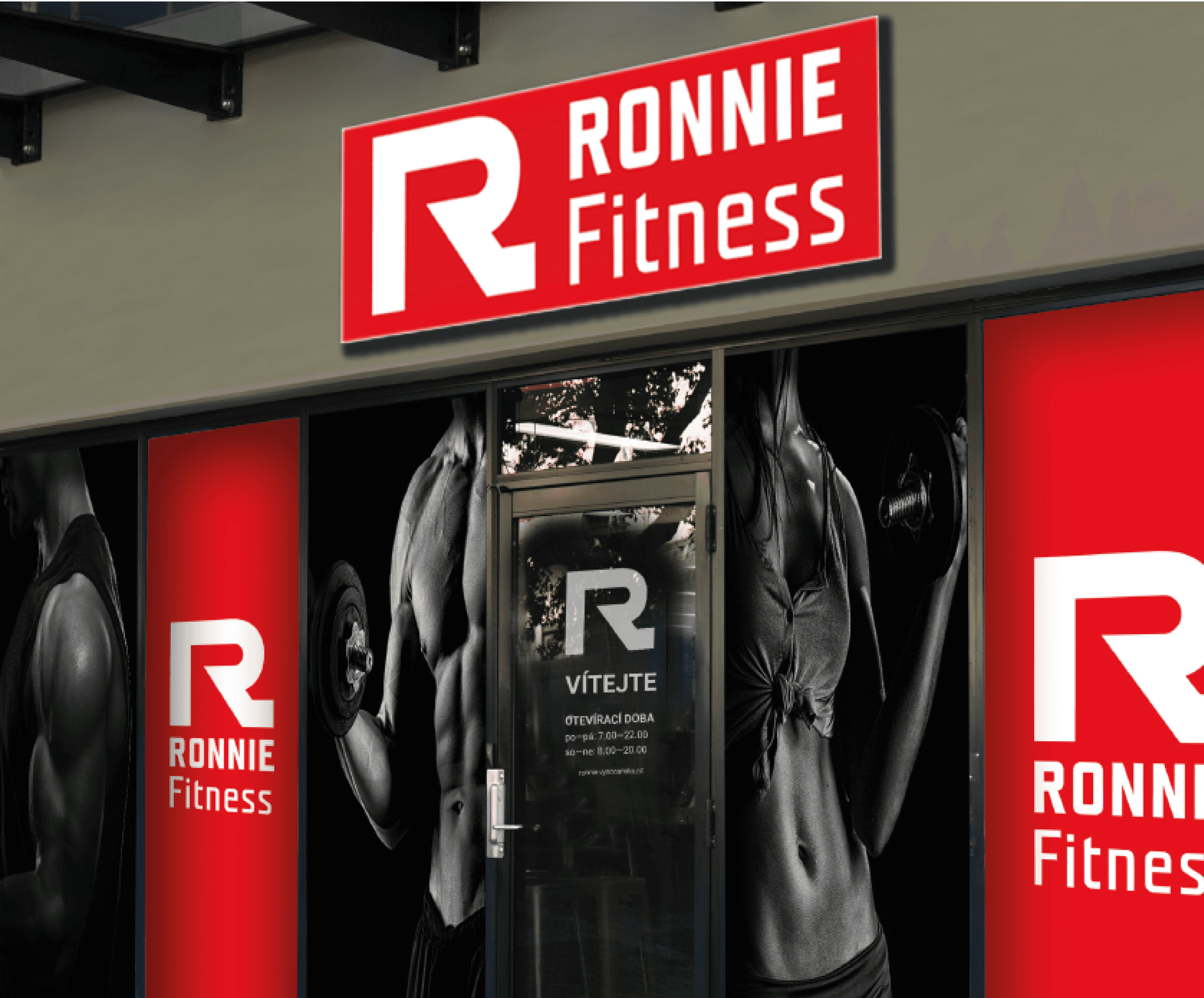
Interior visual design

Visual design in Exterior
(propagation of the gym)
Examples of usage new logo on merchandise
Here is the second part of the gym's visual identity, including photos, other graphic elements, and the logo on merchandise.

Merchandise examples with new logo
Redesign of the web page
Here is a sneak peek at the redesigned home page of the website.

Website redesign
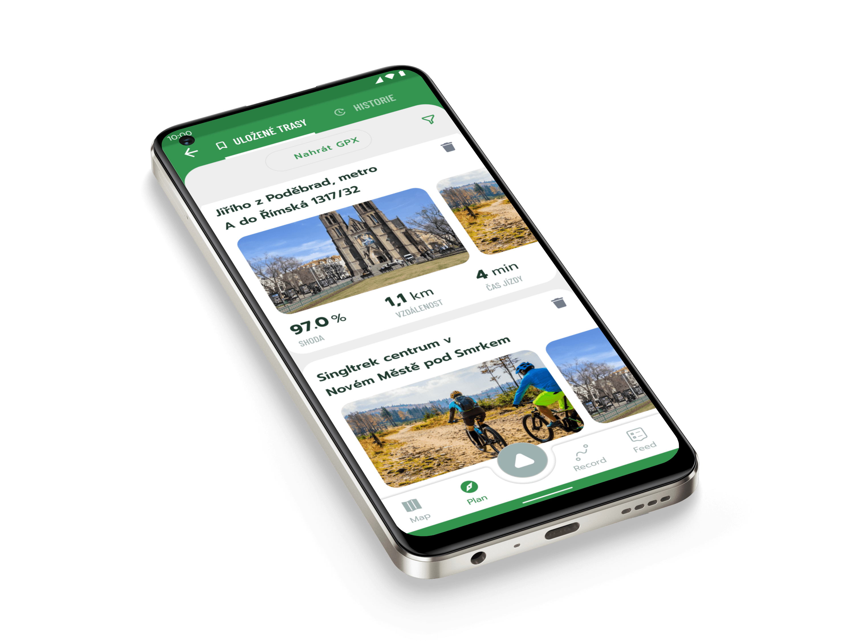
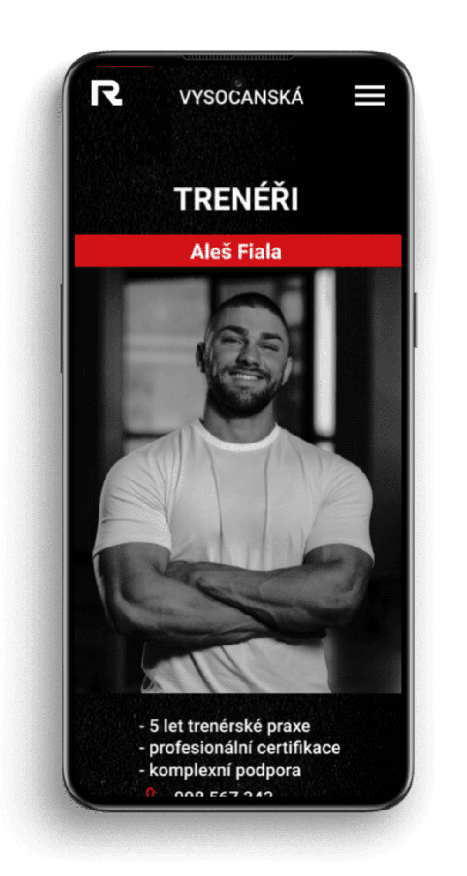
Mobile App/mobile version of the website
Minimalist version of the mobile app, showcasing pages such as trainers, contact, expanded menu, and more.

After the presentation at school...
I showed thís redesign to the branch manager, because I kind of know this guy, and he liked it but dont plan to change it at the moment. because the redesigned a logo not so long ago and have a lot othe things to do before redesigning a website.
We haven't been in contact for a long time and in that time they have already changed it themselves, for the better for me and compared to my proposal, they decided on a bright design
However, it was a fun project on which we practiced a whole range of graphic techniques and disciplines and learned a lot of new things. At the same time, when I look at it today, I immediately see what went completely wrong and could be done much better.
Look at other projects as well
Cyclers App
Bike navigation
2021 - 2023

Food delivery app
Case study
2021 (2 weeks)

Mixposters
E-shop with graphic posters
2013 - 2022
A quick peek at the old logo and website design
I probably didn’t need to point out that this workout, gym, and supplement website looked outdated and needed a redesign. The logo had already undergone some redesigns but could still be improved and made more versatile. It only featured the name and a tornado shape.
My new logo design
Here are a few variants and color combinations for my new logo redesign. I chose a minimalist typography style that allows the logo to be used with or without the gym's name. The red color can be used alone or in combination with black. The symbol was a modified letter 'R,' and the font used for the text is 'Teuton.'
Text version & color
Look at other projects as well
Examples of logo usage
Here are examples of gym posters and the logo used as decorations in the gym


Interior visual design
Visual design in Exterior
(propagation of the gym)
Mobile App/mobile version of the website
Minimalist version of the mobile app, showcasing pages such as trainers, contact, expanded menu, and more.
After the presentation at school...
I showed thís redesign to the branch manager, because I kind of know this guy, and he liked it but dont plan to change it at the moment. because the redesigned a logo not so long ago and have a lot othe things to do before redesigning a website.
We haven't been in contact for a long time and in that time they have already changed it themselves, for the better for me and compared to my proposal, they decided on a bright design
However, it was a fun project on which we practiced a whole range of graphic techniques and disciplines and learned a lot of new things. At the same time, when I look at it today, I immediately see what went completely wrong and could be done much better.
A quick peek at the old logo and website design
I probably didn’t need to point out that this workout, gym, and supplement website looked outdated and needed a redesign. The logo had already undergone some redesigns but could still be improved and made more versatile. It only featured the name and a tornado shape.
My new logo design
Here are a few variants and color combinations for my new logo redesign. I chose a minimalist typography style that allows the logo to be used with or without the gym's name. The red color can be used alone or in combination with black. The symbol was a modified letter 'R,' and the font used for the text is 'Teuton.'
Text version & color
Examples of logo usage
Here are examples of gym posters and the logo used as decorations in the gym


Interior visual design

Visual design in Exterior
(propagation of the gym)
Examples of the new logo used on merchandise
Here is the second part of the gym's visual identity usage, which includes photos and other graphic elements and logo on merchandise.
Merchandise examples with new logo
Examples of the new logo used on merchandise
Here is the second part of the gym's visual identity usage, which includes photos and other graphic elements and logo on merchandise.
Merchandise examples with new logo
Redesign of the web page
Here is a sneak peek at the redesigned home page of the website.
Redesign of the web page
Here is a sneak peek at the redesigned home page of the website.
Website redesign
Mobile App/mobile version of the website
Minimalist version of the mobile app, showcasing pages such as trainers, contact, expanded menu, and more.
Look at other projects as well
Cyclers App
Bike navigation
2021 - 2023
Mixposters
E-shop with graphic posters
2013 - 2022
After the presentation at school...
I showed thís redesign to the branch manager, because I kind of know this guy, and he liked it but dont plan to change it at the moment. because the redesigned a logo not so long ago and have a lot othe things to do before redesigning a website.
We haven't been in contact for a long time and in that time they have already changed it themselves, for the better for me and compared to my proposal, they decided on a bright design
However, it was a fun project on which we practiced a whole range of graphic techniques and disciplines and learned a lot of new things. At the same time, when I look at it today, I immediately see what went completely wrong and could be done much better.
I hope you enjoy your journey through my portfolio.
Let’s discuss your project!
Let’s talk
Back
I hope you enjoy your journey through my portfolio.
Let’s discuss your project!
I hope you enjoy your journey through my portfolio.
Let’s discuss your project!
Corporate identity
Redesign of the visual identity of gym “RONNIE”
Summer 2019
Duration
Role
Graphic designer
UI
webdesign
Tools
Adobe Illustrator
Adobe Photoshop
Figma
Graphic design
webdesign
logo manual
webdesign
user interface
Topics

This was my final project at vocational graphic school. I decided to undertake a complete redesign of the visual corporate identity for the gym where I occasionally work out. While the gym offered excellent facilities, its visual presentation was somewhat outdated, so I took the initiative to create a redesign.
I designed a new logo, a fresh style for the entrance, gym machine instruction labels, and branding. I also attempted a redesign of the website and app. Here are the results:
Corporate identity
Visual identity of gym redesign (2019)
This was my final project at vocational graphic school. I decided to undertake a complete redesign of the visual corporate identity for the gym where I occasionally work out. While the gym offered excellent facilities, its visual presentation was somewhat outdated, so I took the initiative to create a redesign.
I designed a new logo, a fresh style for the entrance, gym machine instruction labels, and branding. I also attempted a redesign of the website and app. Here are the results.
Corporate identity
Redesign of visual identity of gym “RONNIE”
Spring 2019
Duration
Role
Graphic designer
Web design
UI
Tools
Ai
PS
Figma
Graphic design
Web design
Logo manual
User interface
TOPICS
This was my final project at vocational graphic school. I decided to undertake a complete redesign of the visual corporate identity for the gym where I occasionally work out. While the gym offered excellent facilities, its visual presentation was somewhat outdated, so I took the initiative to create a redesign.
I designed a new logo, a fresh style for the entrance, gym machine instruction labels, and branding. I also attempted a redesign of the website and app. Here are the results.
Examples of the new logo used on merchandise
Here is the second part of the gym's visual identity, including photos, other graphic elements, and the logo on merchandise.
Merchandise examples with new logo
Redesign of the web page
Here is a sneak peek at the redesigned home page of the website.
Website redesign
Corporate identity
Visual identity of gym redesign (2019)
This was my final project at vocational graphic school. I decided to undertake a complete redesign of the visual corporate identity for the gym where I occasionally work out. While the gym offered excellent facilities, its visual presentation was somewhat outdated, so I took the initiative to create a redesign.
I designed a new logo, a fresh style for the entrance, gym machine instruction labels, and branding. I also attempted a redesign of the website and app. Here are the results.